For the most part, the onpress experience for the Blueline Magazine - Spring 2016 Edition went smoothly. We always rely heavily on the expertise of the printers we work work (in this case, Chicago’s Classic Color), and as usual they didn’t disappoint!
One takeaway from this experience: never be afraid to go back to prepress if an image isn’t performing the way you need it to onpress. Yes, it does cost money and it might lengthen the time of your press check a bit. But spend a few extra bucks is better than a disappointed client (if your budget and the schedule allow, of course).
One example for me occurred on the front cover of our latest Blueline Magazine. The background we used had a subtle grey noise pattern to it. In the proof, it looked great; on press, it looked like print mottle. As a paper company, showcasing a mottled look (even if it’s actually due to the artwork) isn’t what we’re after. So, we made the decision to go back to prepress and change the background to a 15% black, which printed beautifully.
Another goal when printing the Blueline Magazine is to make sure our contributors printed pieces are represented as beautifully as possible. In general, photographs of printed pieces can ultimately prove to be a little problematic—this can especially be true if you’re receiving imagery from a variety of sources. In this issue, there were a few instances where the images looked great in the proof, but needed to be pushed a little once we were on-press.
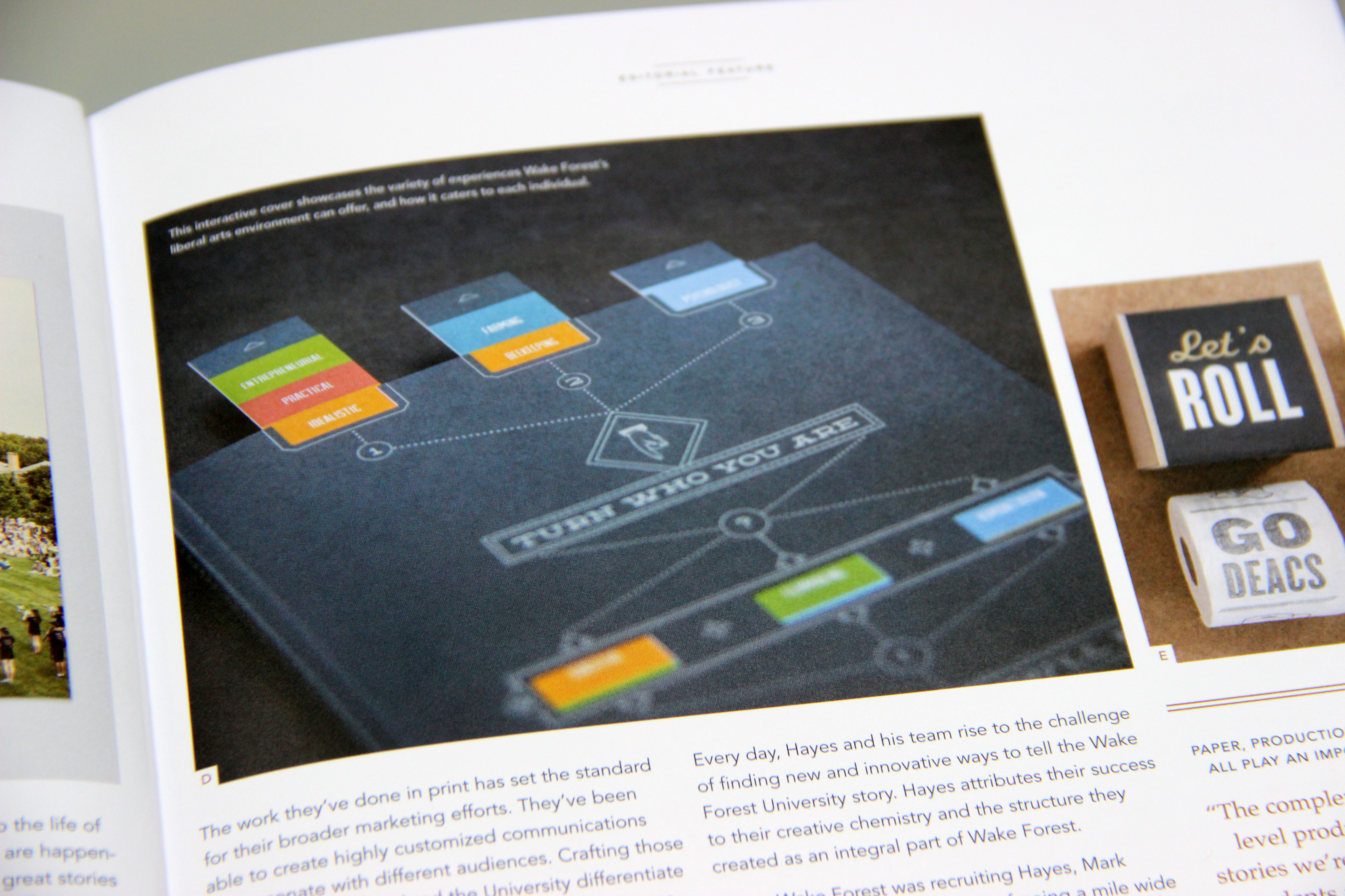
In the instance above, we needed more differentiation between the dark blue brochure and the background. When I first saw this image onpress, the edge of the book and the background blended together, making the subject of the photograph unclear for the viewer.
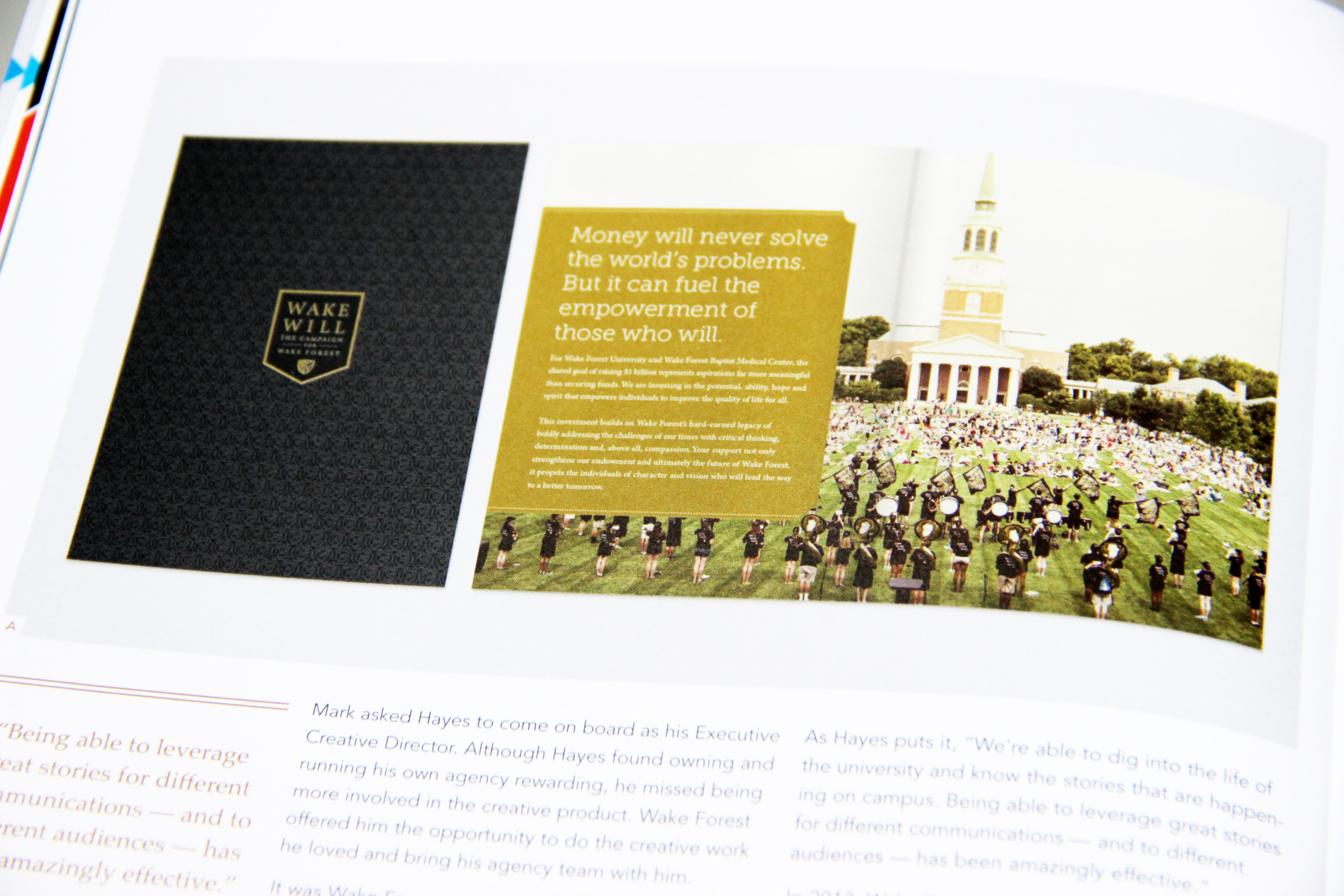
The photo above is another instance where going back to prepress was the right call. When I first saw the image on-press, the cover of the brochure looked black. After going back to prepress, the beautiful tone-on-tone pattern ended up looking fantastic!
As a final note, the decision to go back to prepress shouldn’t be taken lightly. The goals of the project, budget, usage, lifespan, audience and client should all be considered. But remember, print is permanent. So, if you’ve weighted all the factors and still feel a critical image isn’t performing well, don’t hesitate to speak up!
Anxious to see the final results from this onpress experience? Sign up for your complimentary subscription to Blueline Magazine!