The Print Guide blog by Gordon Pritchard defines ghosting well:
A printing "ghost" is an unwanted image resulting from the printing system itself. There are basically two kinds: mechanical and chemical.
Mechanical ghosts are usually visible as soon as the press sheet lands in the delivery section of the press. There are three types of mechanical ghosts: starvation, blanket, and plate.
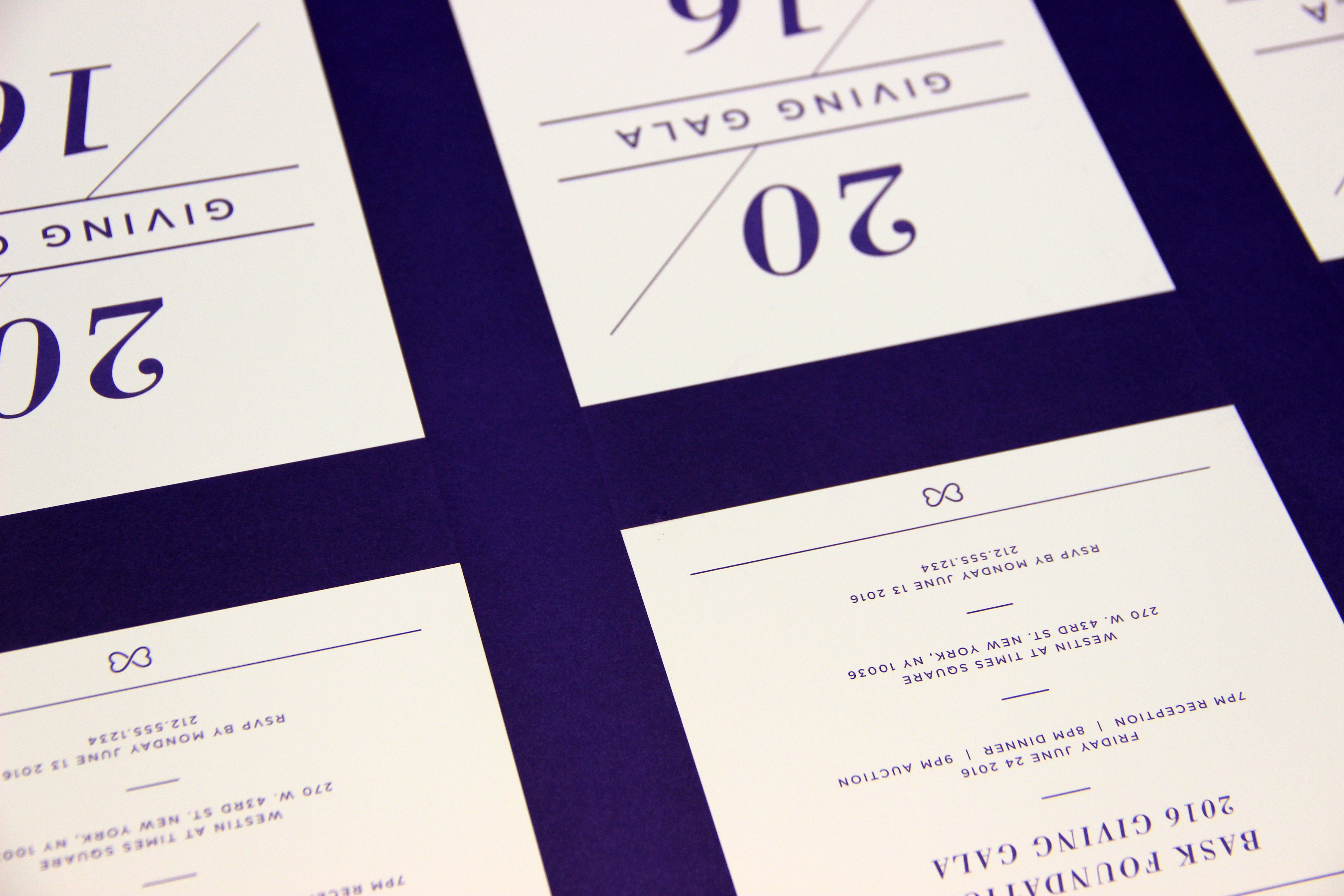
On a recent print job we ran into an issue with ghosting due to the layout of our form. Although we were printing a single match color, because of the way our form was laid out we could clearly see lighter and darker stripes in the solid.
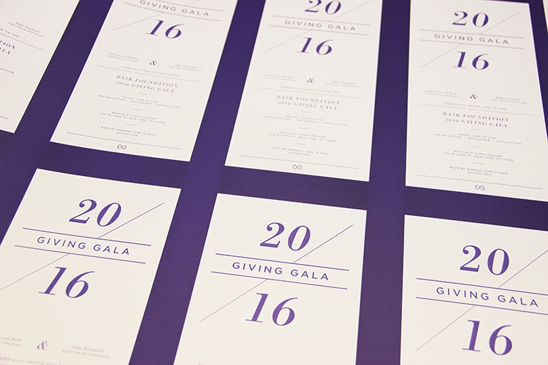
We had created a starvation ghost. A starvation ghost appears when one part of the design calls for so much ink to be laid down that the ink rollers do not have time to re-ink. When this happens, certain areas of the form will have lower ink density than adjoining areas.
Starvation ghosts will not show up in off-press proofs because the proofs are (usually) printed with an inkjet system. There are various steps that can be taken to avoid starvation ghosts.
- Be aware of design elements that lend themselves to ghosting. Designs with heavy borders (like the one we were printing) are susceptible to this issue.
- Share your design early with your printer. He may be able to position the page on the sheet or group forms in a way that minimizes the chance of ghosting.
- Use the trim area of the form to balance the ink. The printer can add take-off bars outside the image area to balance the amount of the ink being pulled off the ink rollers. Take-off bars are trimmed off after printing but help balance the ink demand so color prints evenly.
Unfortunately, we were not able reposition our images or add a take-off bar on our form. We opted to work with pre-press to try and balance our color. In our first attempt at balancing the ink density, pre-press reduced the areas where we were getting heaviest ink density to a 90% screen. This was done to try and bring the ink density in the heavier printing areas down to match the lighter print areas. This caused a halo or lighter looking line where the screen butted up against the solid.
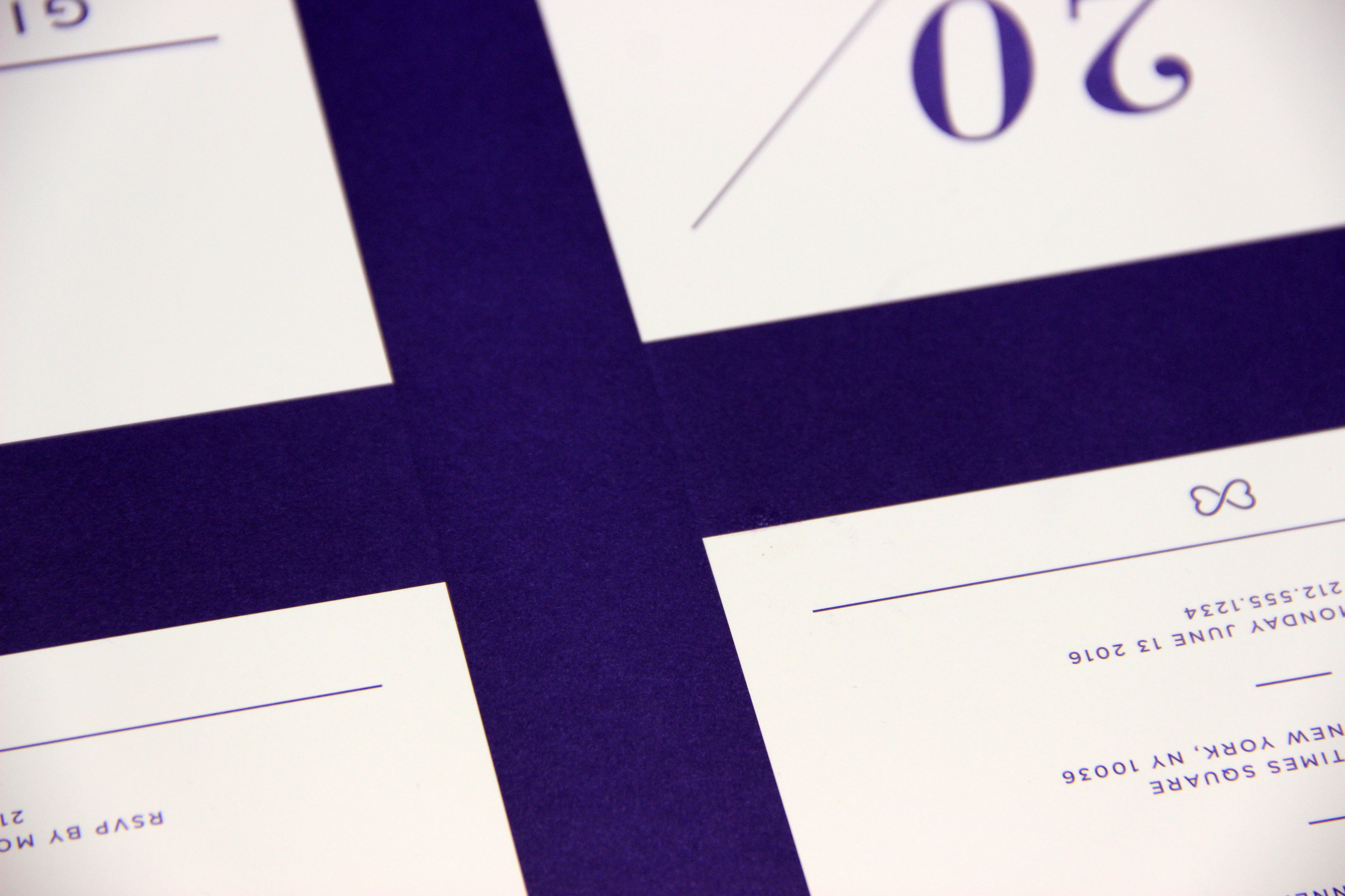
On our second attempt, we had success! We created a vignette and gradually went from a heavy screen to a solid across the higher ink density area. This resulted in the 2 areas bleeding together and forming a uniform border.
Ghost(ing) stories can be annoying and keep you up at night but with a little planning, ingenuity and a creative pressroom or prepress practices, you can take the boo right out of the ghost.